

Company/Client
Deliverables/Services
Lead the end-to-end redesign effort of the digital commerce responsive website
Timeline
AI Assisted Responsive Web & Mobile Design of E-Commerce Shopping Experience
Creating frictionless, beautiful, consistent and effective experiences cross website, tablet and mobile seamlessly, with the help of AI.
Overview
Kathy Kuo Home, New York, is a stylish interior design firm and eCommerce online shopping company for luxury furniture, interior decor, and homeware. It stands out in the field with modern classic tates, aesthetic Interior design and great customer services.
The company launched its first site 6 years ago, since then they have grown into one of the nation’s fastest growing multi-channel, B2C/B2B E-commerce companies. The legacy website was built a long time ago with limited capacity and functionality. It had become a bottleneck for the company's growth and scale. The redesign of the new site will bring a more contemporary look and feel to the website; being truly responsible instead of switching between misaligned mobile and web experience. We'll add important new features, address customers pain points, and maximum the efficiency and sales.
Main challenges/problems were
- No clear plan for the transition from legacy site to brand new experience.
- No systematic Design process; everyone is doing their own thing without understanding the big picture and dependencies.
- Lots of pain points and disconnections on the shopping journey.

Design Strategy
The legacy website has it's pros and unique style,
- Aesthetic, curated and personalized product information
- Embody the interior designer's DNA (inherited from the founder/CEO to the whole team) on the look and feel of the website
- Content is up to date, aligns with the season and trends
Kathy Kuo Home is a fast growing company, and in the meantime, it's facing numerous competition in the Industry; therefore, the keys for the success are,
- Leverage its unique story and professional interior designers' insights on home products
- Smooth out the customer journey by understanding target users' needs, ease their pain points, and help them reach their goals of building homes they love.
- Use AI tools to analyze huge amount of data and to understand the effectiveness of alternative experiences design
- Prioritize the most impactful investments
- Leverage various AI tools for efficiency and productivity on product processing and content generation

Background
Brought in as the Lead UX/UI Designer and Researcher, I established our process and used it to lead the team through its major redesign on responsive interface and CRM platform. This laid the groundwork for multiple subsequent iterations that would almost double the site's conversion rates.
The current digital business has about
- 10M pageviews per month.
- 12K transactions per month.
- $400M annual sales.
- 120% revenues growth YOY for last 3 years.
Team:
- Me as the UX Lead, UX researcher and UX/UI designer
- A Graphic Designer
- A Content/Product analyst
- A Data analyst
Process
I led this project and was supported by a team of 4, I was the sole individual responsible for User Experience and I personally created the deliverables that you will see in this case study, excluding UX research documents, responsive page designs, most graphics, and design specifications for engineering team. I saw the project through from the kickoff meeting to the release, and multiple rounds of iteration afterward.
Phase 1: Discover & Research

1.1. Stakeholder and User Interviews
I conducted interviews with representatives from Product/Merchandising, Marketing content, Sales, Services, Support, and Executive Leadership to understand each part of the company’s unique requirements and concerns for the design, and used it as the basis for customer-specific insights.

1.2. E-commerce Competitive Analysis
I identified major competitors with similar business models and demographic customers and did research on their web products and design strategies for the key components, including
- Branding
- Overall design, Look and feel
- Target users
- Product details
- Checkout experience
- Order confirmation and follow-up
1.3. Digital Survey and Data Analysis
I began by digging into our historical data with a data analyst, surfacing user pain points and barriers to conversion. One pattern we saw is that users commonly browse lots of products, but leave the site without placing order, or they add products to cart but didn't checkout.
For example, we saw significant increases in add to cart activity during the promotional days, and cart completion rates spiked on key days of the promotion 40% vs average, but Cart abandon rate is up 65% compare to average. So that's a pain point of customers who are interested to buy but didn't somehow.


1.4. Personals and User Journey
I did my research and ran workshop to revise the primary customer personas, look into their journey maps, and touch point from different channels and devices. A full user experience is not just on the website, but also includes print catalogs, emails, social media interactions, packaging and shipping, returns, and follow ups.
We built personals and their shopping journeys, pain points.

Phase 2: Define & Design
2.1. Define and Prioritize the Key Functionalities and Improvements
- Homepage with unique highlights
- Product browsing experience
- Product Details
- Smooth Checkout experience with various payment options
- Account and transaction history
- Blogs & Social Media for inspirations
- Interior Design service
- Header, footer and misc
2.2 Wireframes
Once we had a solid direction for the design, I began to produce multiple different variations of wireframes. I listed pros and cons of different designs, did feasibility analysis with IT, and reviewed with internal stakeholders.

2.2. Mockups & Interaction Flow
I created mockups from scratch, referenced the existing website style guide, and significantly extended it.


2.3. Interactive Prototype
I created an interactive prototype using Figma. This will demonstrate not only the interface, but also the interaction and the navigation flow. I then put the prototype in front of users and stakeholders for testing and feedback. Finally, I refined the design.

2.4. Visual Design
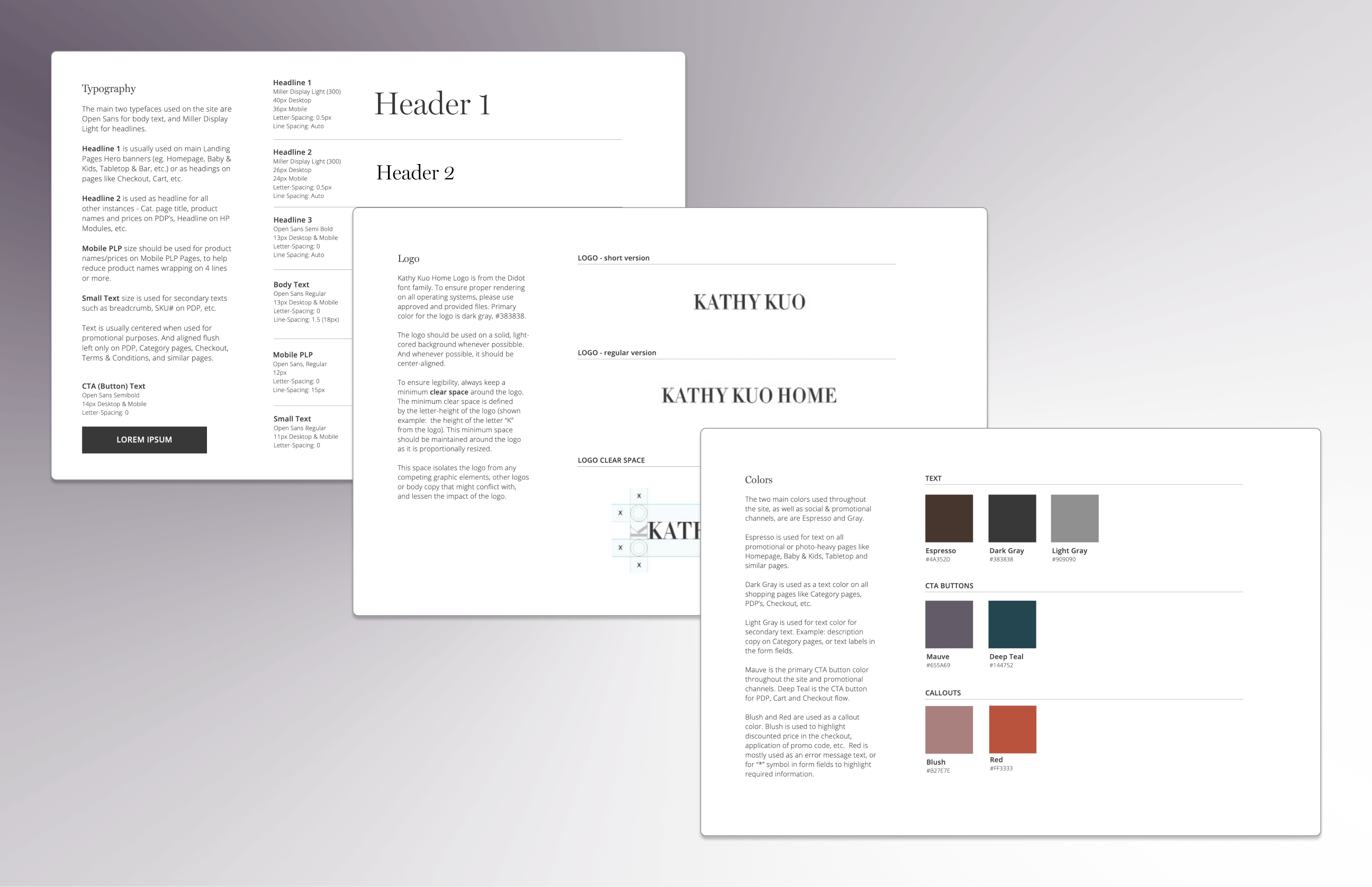
I consolidated Kathy Kuo Home Style Guide to streamline the look and feel of the band across different digital channels - web, mobile, social media, email and marketing campaigns. To maintain the high-end luxury brand image, we chose two main typefaces - Open Sans for body text, and Miller Display Light for headlines. The primary colors used throughout the site, as well as social & promotional channels, are are Espresso and Gray, which reflect the elegant and modern classic style of our taste of products.
Interaction Design
The new interaction design "Choosing the Seating and the Right Rug" solved the pain point of customers' confusing on matching seating and rug size for different room/ areas. It's a very intuitive visual for size matching tutorial, I had lots of fun creating this Interaction.

This interaction shows the dramatic changes of before and after comparison.

Another example of intuitive interaction design of FAQ (Frequently Asked Questions)

The final UI is absolutely beautiful, captured the spirit of elephant modern classic ensense of the brand; it display smoothly cross desktop, tablet and mobile devices; it solved many pain points from customers on their shopping journey. Everyone loved it!


Plus the design of new features such as text message with promo image. This new feature got 50%+ response, especially from users who added product to Cart but abandoned Cart. It added a new method and channel to fill the gap on Checkout journey.

2.5. Accessibility
Over 19% of the U.S. population is disabled. Accessibility and device compatibility were crucial to all of our users. The design needed to perform across multiple different devices by utilizing a fully responsive design and stable code. This code would then need to hold up well in devices built for accessibility purposes, meeting the threshold of text color contrast, screen readers etc., and/or let users adjust visual settings if they want. We followed WCAG 2.0 guidelines.

2.6. Improved End-To-End Experience With AI
Lots of improvements needed on the end-to-end experience. For example, we improved product recommendations with AI automation of the most relevant products for cross-sell and upsell. A/B testing results in the highest rated relevancy content, which will be feed to the site experience.

Phase 3: Develop & Implementation
The design requirements were translated into JIRA user stories. After IT backlog grooming, sprint planning, sprint development, QA, UAT, regression testing, it was ready to go live!
The design was tested across devices on desktop and mobile browsers and multiple versions of Chrome, Safari, Firefox, Internet Explorer, Edge.
Phase 4: Release & Follow-up
After one year's project planning, discovery, design and implementation, the redesigned website was released at an exciting time!
The Achievements

KPI Improvement
Significantly improvement on conversion rate (18% lift), add to cart (22% lift), revenue per session (12% lift) etc.
Performance Improvement
The website loading time is twice as fast as before (thrilling)!
Operational Efficiency
The new CRM platform made content management easier and faster!
